
SUMMER CAMPS are LIVE!
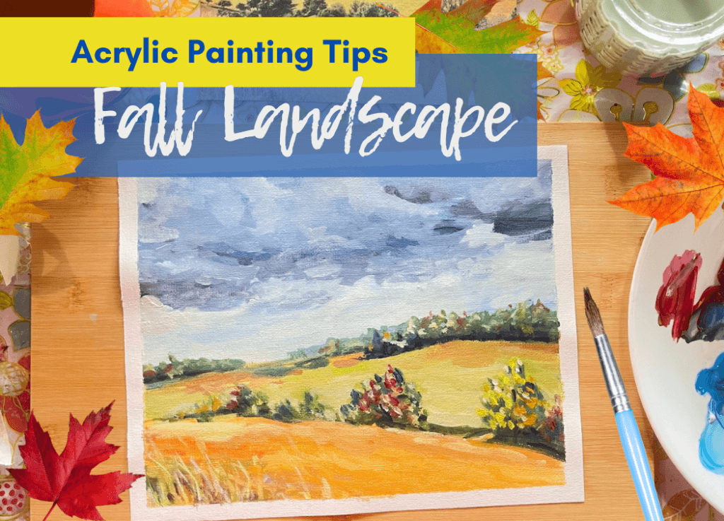
There are few things more tempting for me to paint than a fall landscape.
The deep, purply colors of heavy fall clouds over warm, golden fields are my absolute favorite kind of landscape to paint.
In this quick, easy, 30-minute acrylic landscape study, I’ll show you how to simplify a reference photo, and we’ll even add fall colors to trees that aren’t quite colorful enough.
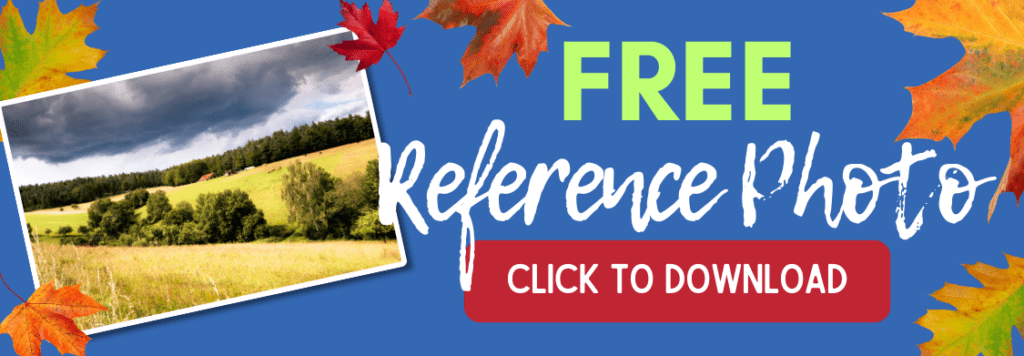
This project is perfect for beginners, and I’ve even included a free download of the reference photo I used to help get you started.
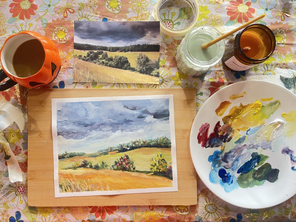
Follow the full, step-by-step process below, and check out this full video tutorial:
Before you get started –
Download and print the Reference Photo. No need to print on fancy photo paper. Printer paper will do just fine.
Materials You’ll Need:
Colors:
Beginner Fall Landscape Painting Tips and Tricks:

Step 1: Loosely sketch the hills and sky with thinned paints. Use VERY loose and confident strokes to quickly fill the canvas. Don’t get too caught up in exact colors at this time. Notice, I added more white to the sky color as it gets closer to the horizon.
Sky Colors: light blue + white
Hills Colors: light yellow + touches of red + touches of light blue for greener areas
Don’t forget to use water to thin those paints! Especially in the sky.

Step 2: Roughly add your darkest colors to the trees, clouds, and hills. Block in the rough shapes, using your reference photo.
Darkest Tree Colors: Use the dark blue and a touch of yellow ochre to mix a very dark green.
Darkest Cloud Colors: Use a mixture of our dark blue and dark red, which will make a beautiful purply-grey color.
Darkest Hills Colors: Use a variety of straight yellow ochre and yellow ochre mixed with dark blue and/or red.
Also, remember to edit down the number of trees in the foreground. We don’t have to replicate the photo exactly, and we only have 30 minutes!

Step 3: Layer on the middle values. Now it’s time to layer on the middle values over the darks. So, basically, we’re using the same dark colors, but lightening them.
CAREFUL! Don’t cover your dark values completely. Layer the middle values over, but slightly higher than darks, in the direction of the light source (the sky).
For the sky, lighten with white.
For the trees, try not to lighten with white because the greens will get chalky. Instead, lighten with more yellows, or maybe a touch of your light blue.

Step 4: Add fall colors to the trees. With thicker paint this time, add some touches of straight red and yellow to the trees.
Don’t be too heavy-handed here. Keep it subtle.
Step 5: Finish with quick highlights and details. In our final layer, we’ll add our lightest values. Use the same lightening techniques as in step three.
Fields: Add some more texture and highlights in the fields with various shades of very thick paint. Don’t use water to thin the paints with these final textures.
Trees: Highlight the closer trees sparingly with thick, almost-white mixtures. The farthest row of trees with need darker, thinner highlights. This will help make them appear more distant.
Clouds: The highlights on the clouds should be almost pure white and thinned with water to keep them whispy.
Finally, add the front grasses with thinned yellows that are lighter than the front hill so that they really stand out. The thinner the paint, the easier it will be to get those sharp lines.
I hope you enjoyed painting this lovely Fall Landscape with me. As always, it’s all about learning and pushing ourselves forward as art students. Progress, not perfection!
Let me know how it went!